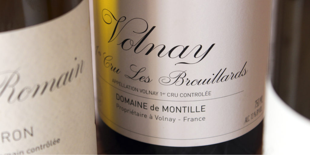
A typeface designed for the wine labels of Domaine de Montille, an independent and family house of high-end Burgundy wines.
Domaine de Montille covers 17 hectares in the region of the great vineyards of Burgundy such as Côte de Beaune, Nuits-Saint-Georges and Vosne-Romanée. The wines have been cultivated by the Montille family for four generations, with a concern for extreme quality and a thorough reflection on the authenticity of cultivation methods.
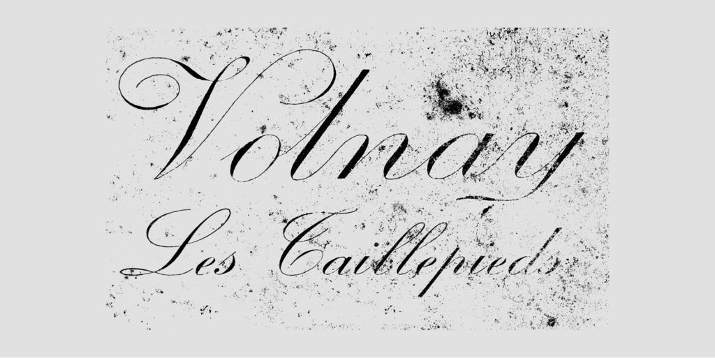
The Montille family has for a long time made a special effort to reflect on its labelling the extreme care they take regarding the development of their content. They had previously engaged the Akiko agency on the graphic design of the labels. During our meeting, Alix de Montille granted me access to the family archive dating back several decades; including a Volnay label, whose lettering had been hand-made by a calligrapher, and which they had used for years on their bottles. But with the changing of printing techniques, they had lost the smoothness of the original lettering. Furthermore, none of the similar fonts available on the market suited them as a replacement. Their request was not only to adapt this ancient lettering to contemporary reproduction techniques, but to also draw an entire alphabet.
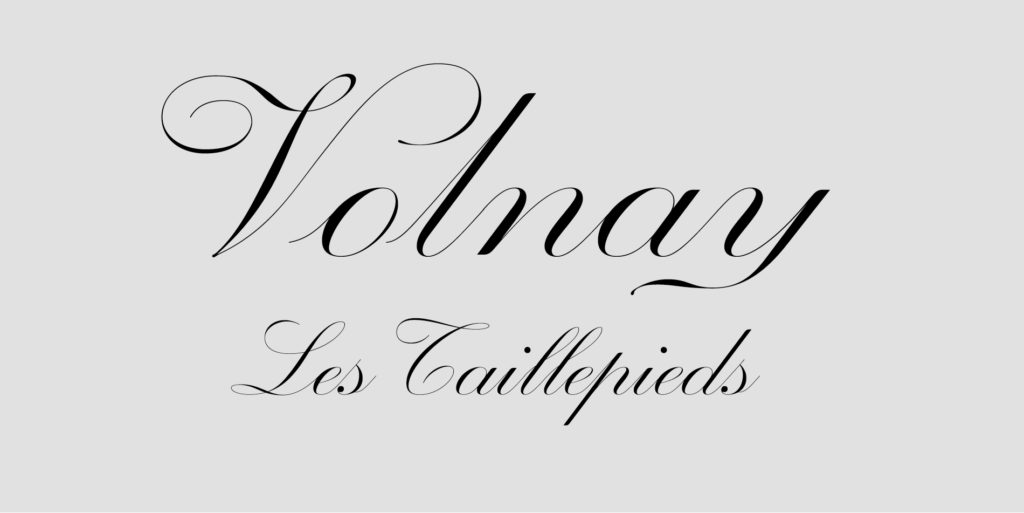
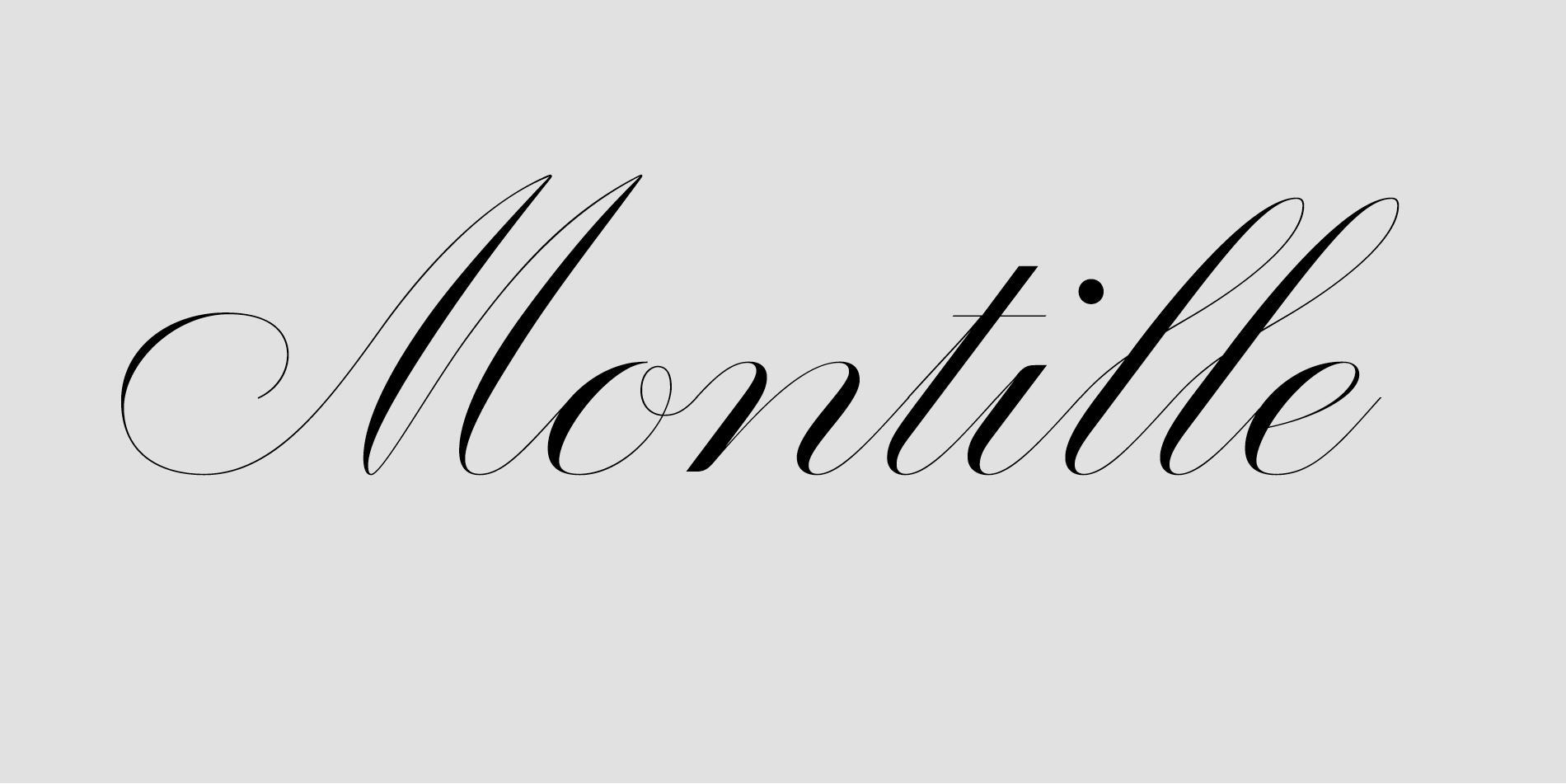
The lettering put us on the trail of a typeface of the Round Hand category. The desired refinement focused on the delicacy of the thin letter strokes, which would achieve a strong contrast while remaining on a regular weight.
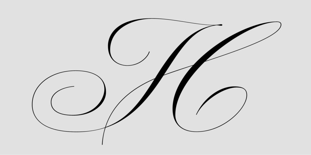
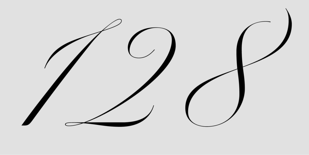
Designing the other letters of the alphabet, capitals and lowercase, from the single word ‘Volnay’, was finally quite easy and natural. I drew on several historical references, calligraphic as typographic, and assembled a vocabulary of shapes in a rather liberal manner. Some letters and figures were born directly from my sketches without me trying to confront them to any model whatsoever.
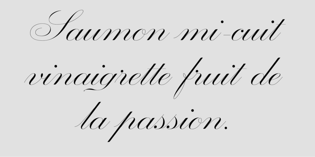
To stick to the attention to detail of these wine-smiths, a concern in which myself as the typographer easily recognized, we added some effects of drops on certain terminations of letters. Drops of ink that can be likened to drops of wine. They are absolutely subliminal of course, but they are there.
This project will have given me a lot of pleasure, in particular by the quality of the dialogue which had been established between passionate craftsmen, each one committed in their practice. It also reinforced the idea that the commissioning of a custom typeface is not reserved for large groups with huge budgets, but that it can also meet the needs of smaller structures, provided that they acknowledge its value.