

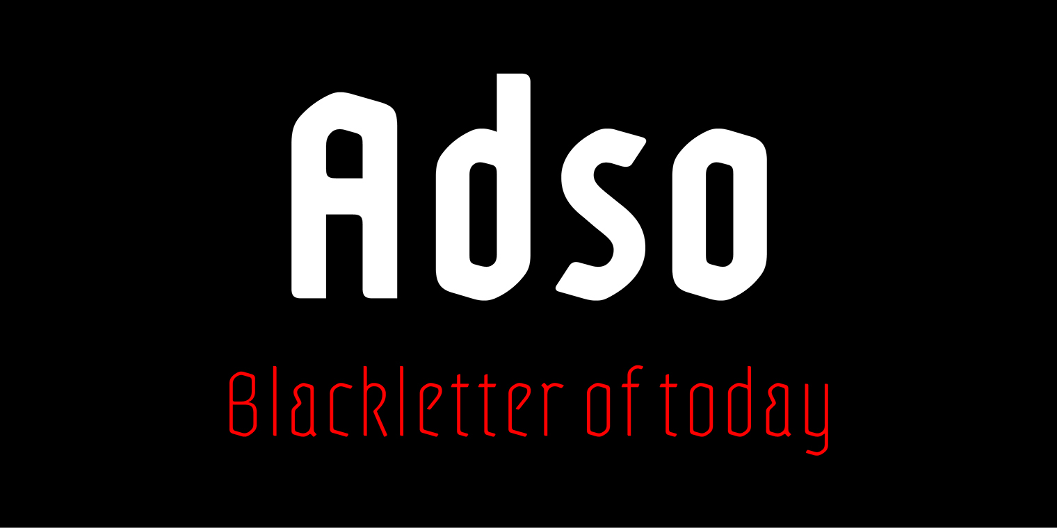
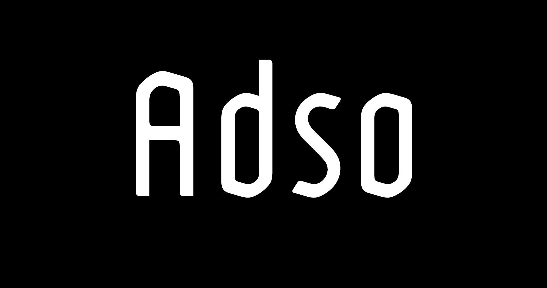
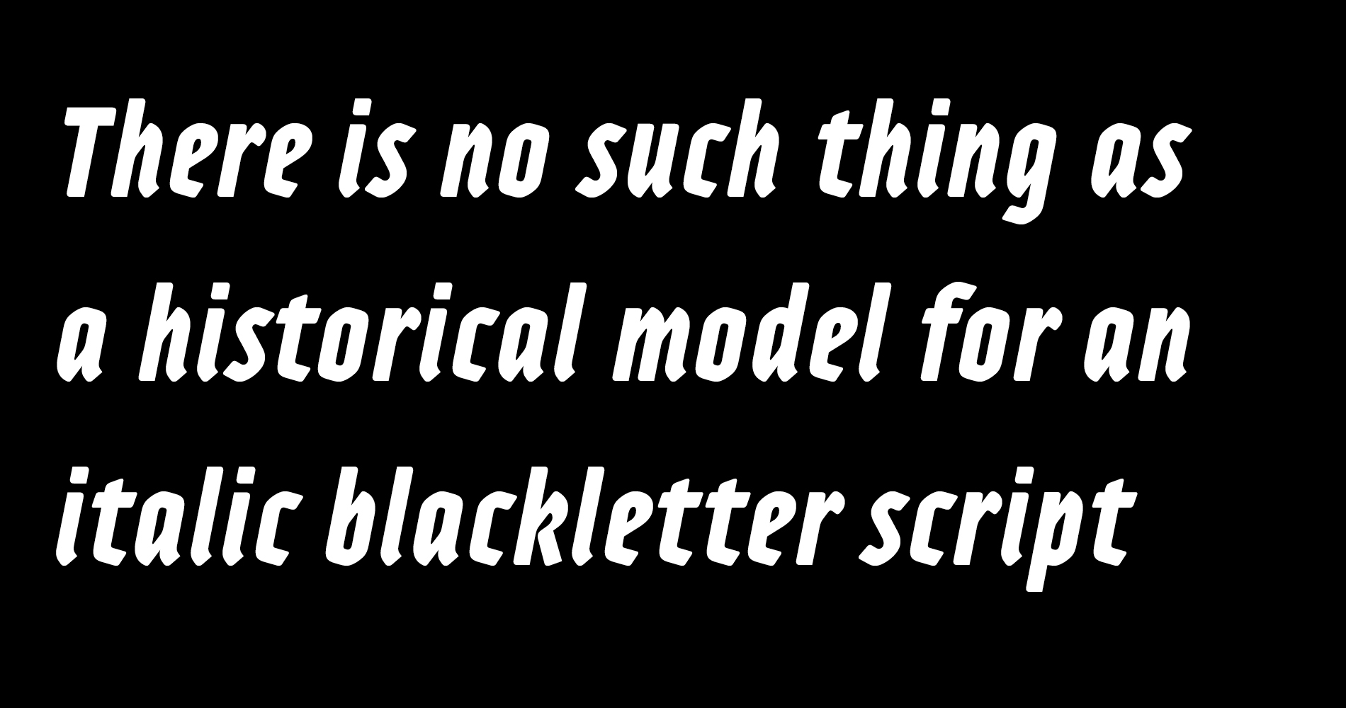
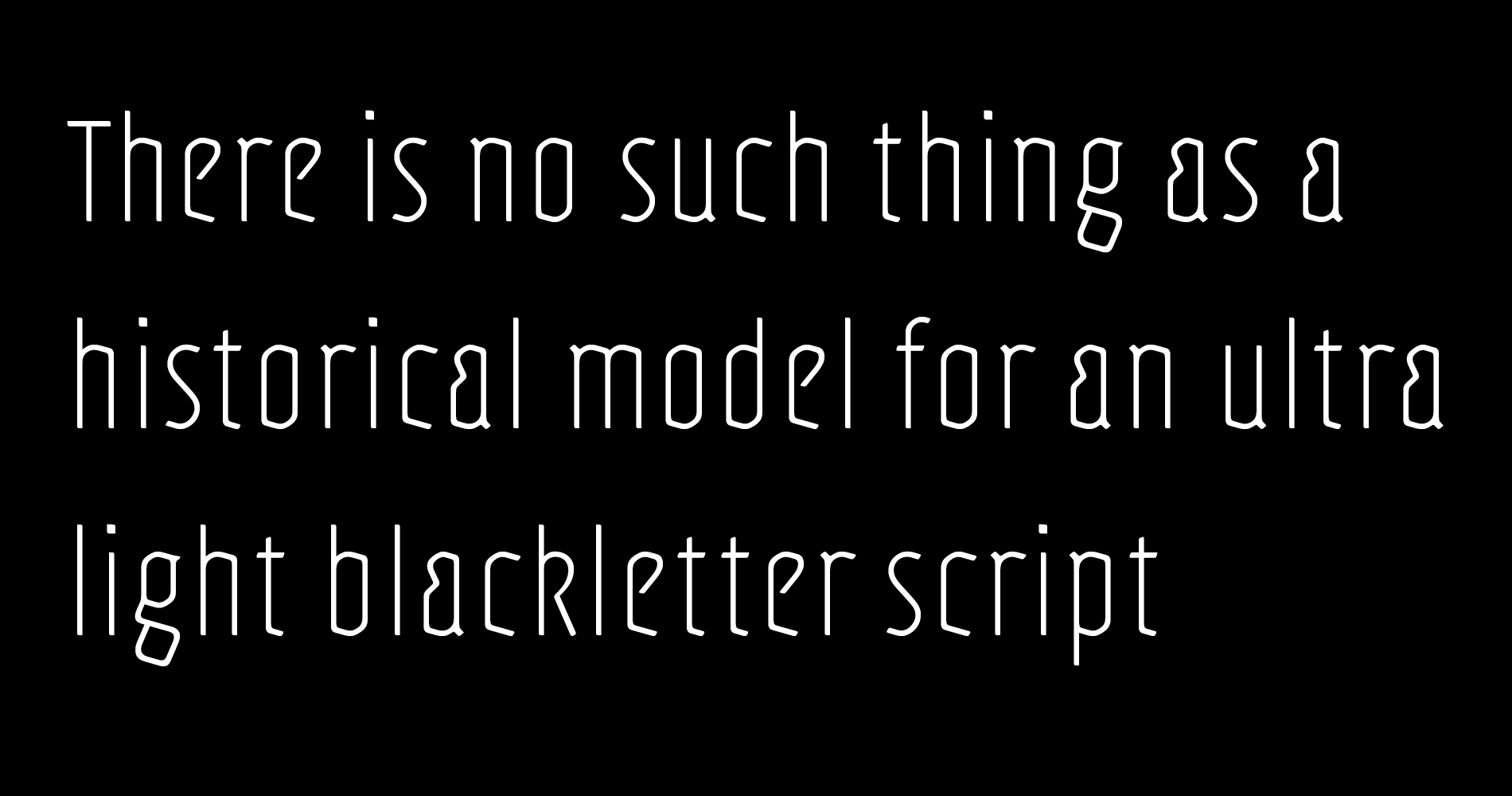
Adso was born out of a research that studied the possibility of reintroducing Gothic writing in our contemporary world. Inspired by Textura, Adso was decidedly freed of all those little details that make Blackletter faces appear foreign or even displeasing to the contemporary reader’s eyes. Nevertheless, the basic features of Gothic color were preserved: verticality, modularity, and darkness. Adso is a gothic font for today’s age, highly readable and open to all fields of expression.
character set
Uppercase, Lowercase, Small, Caps, Ligatures, Case sensitive ponctuation, Lining figures, Old style figures, Superscript, Subscript, Superior, Inferior, Numerator, Denominator, Arrows, Pictograms. Total: 809 glyphs
Opentype features
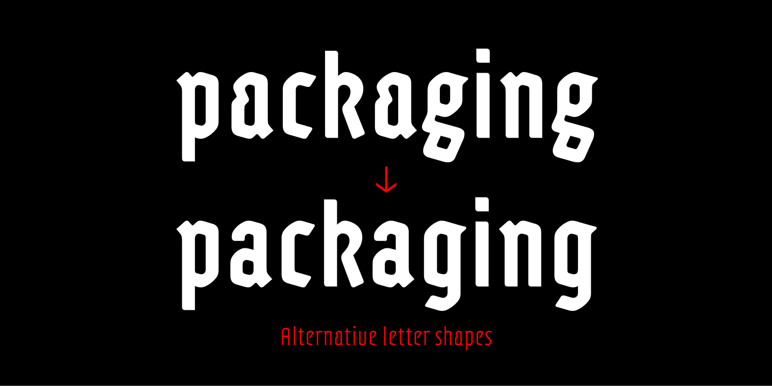
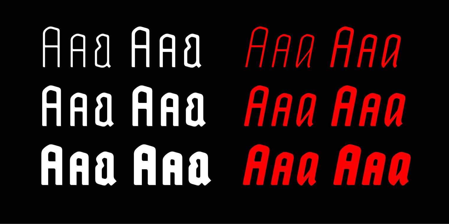
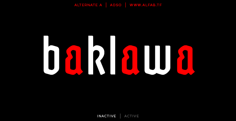
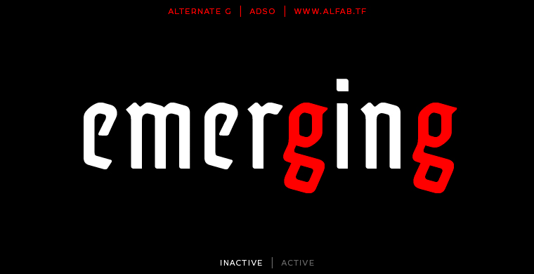
Standard ligatures | All caps | All small caps | Small capitals | Discretionary ligatures | Fractions | Slashed zero | Lining proportional figures | Oldstyle proportional figures | Superscript | Subscript | Localized forms : Romanian, Moldavian, Azeri, Crimean Tatar, Turkish, Catalan, Dutch, German | Stylistic sets : 01 Circled figures, 02 Negative circled figures, 03 Historical forms, 04 Random mixed case, 05 Alternate a, 06 Alternate g
Language support
Afrikaans, Albanian, German, English, Assou, Lower Sorbian, Basque, Bemba, Bena, Bosnian, Cape Verde, Catalan, Chambala, Cornish, Creole Mauritian, Croatian, Danish, Diola-fogny, Embou, Spanish, Esperanto, Estonian, Faroese Filipino, Finnish, French, Riparian Frankish, Friulian, Scottish Gaelic, Galician, Welsh, Ganda, Greenlandic, Gusii, Upper Sorbian, Hungarian, Indonesian, Irish, Icelandic, Italian, Kalenjin, Kamba, Kiga, Kikuyu, Latvian, Lithuanian, Luo, Luxembourg, Machame, Makhuwa-Meetto, Makonde, Malay, Malagasy, Maltese, Manx, Merou, North Ndebele, Norwegian Bokmål, Norwegian Nynorsk, Nyankole, Oluluyia, Oromo, Polish, Portuguese, Romansh, Rombo, Romanian, Roundi, rwa, rwanda, samburu, inari sami, northern sami, sangho, sangu, sena, shona, slovak, slovenian, soga, somali, swedish, swiss german, swahili, taita, czech, teso, turkmene, vunjo, walser, Zulu
![]()
A blackletter for today’s age
Adso is the result of a personal research on the possibility of re-acclimatizing gothic script into our contemporary world.
I’ve always loved blackletter scripts, as I’ve always loved medieval architecture and art in general. From my visiting of churches and castles and from my readings of manuscripts, I felt the desire to study blackletter historical context and to try to better understand their design.
But when I see blackletter used in today's world, I don't always feel comfortable with it.
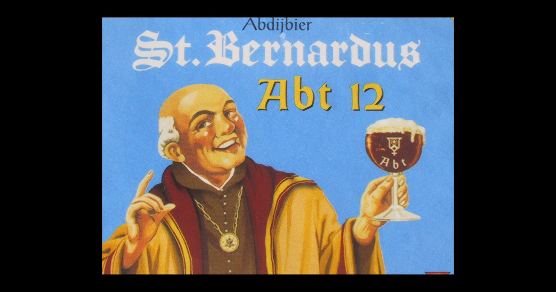
I like the modern use of blackletter when it is meant to suggest notions like tradition or authenticity, as in the antique dealers shop fronts or in some food shop fronts. This seems rightful to my eyes. But I hate to see blackletter typefaces overused in alternative counterculture imagery like in death metal or rap, conveying concepts like rebellion and aggressiveness. As if gothic art had been created to express these feelings. I find it almost an identity stealing.
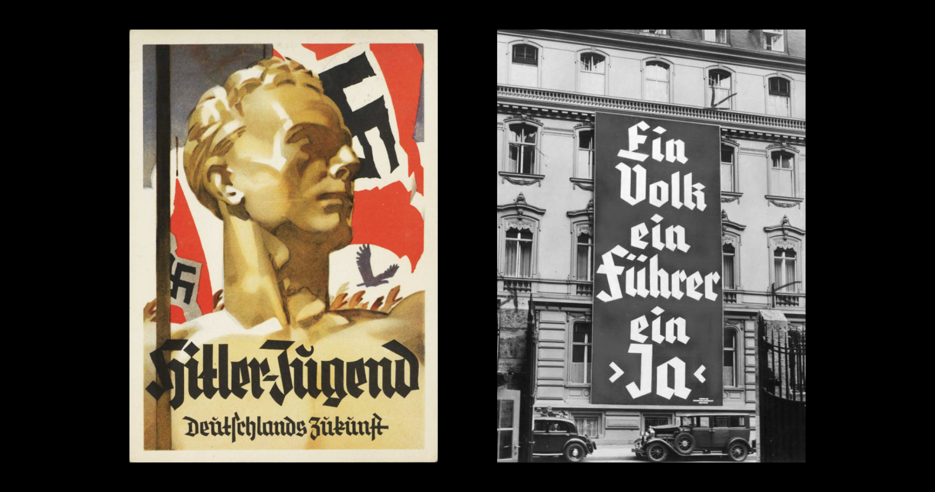
Blackletter is attributed with negative connotations such as violence, rebellion or marginality, since the Nazis made Fraktur faces a component of their discourse on the German racial identity throughout the thirties. Since then, all blackletter scripts have been stained with this infamous correlation.
But reducing blackletter to a German-only phenomenon is a countertruth. It is a European script, invented somewhere between France, Flanders and England, designed to write Latin language, and inspired by Christian and Greek philosophies. It was the script of the scholars in the nascent university. It was designed to be rational and universal. This is the way people saw it at the time.
In any case, blackletter is not a matter of marginality in itself, and I’d be very happy if in our times that fact could be demonstrated once and for all. Fortunately, some people have already dealt with the subject, and I modestly tried to contribute to it with this typeface.
I have had the opportunity to concentrate an entire year on this project, thanks to a scholarship from ANRT in Nancy, France.
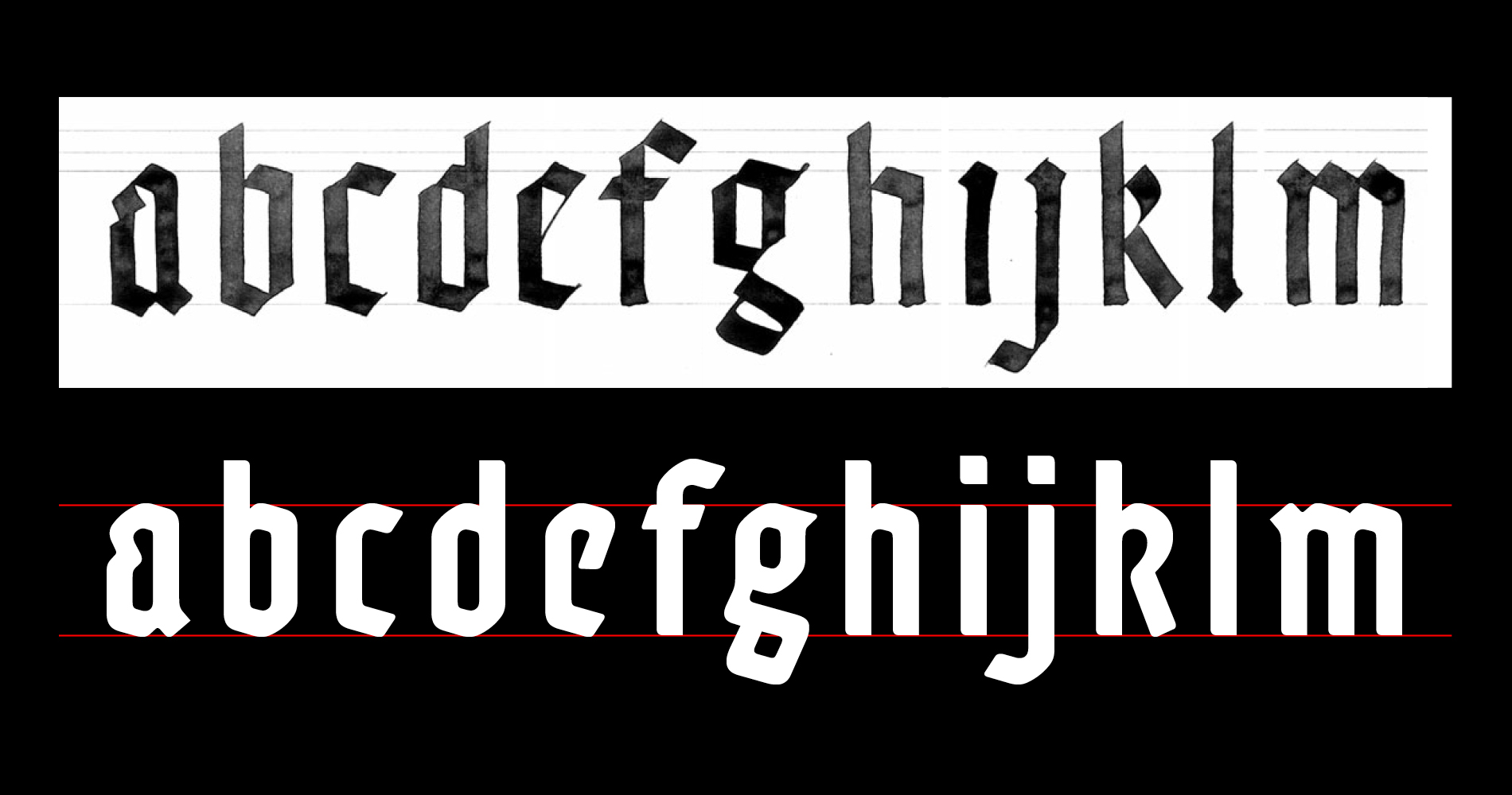
My approach was to amend the historical model of Textura. I started with calligraphy, for about two months. Adso was really born from a penholder. On one hand to take away from it the characteristics that can arouse bad reactions (illegibility, sharp angles). And on the other hand, to add to it some characteristics that suggest the rationality that was its origins. Even if those additions – round corners, diversity of the letter shapes, harmony between lower and upper case – come from humanist traditions.
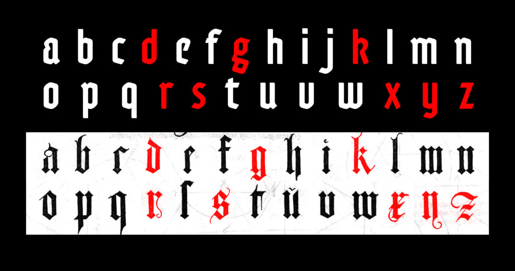
I even transplanted some purely humanist letter structures into my gothic system. In Adso’s characters set, d, g, k, r, s, x, y and z are more or less anachronistic, but they made the whole thing look more familiar, closer to us. Adso’s italic is in the same way a graft from humanist chancery calligraphy, done up to look gothic.
Then I got it through the computer and worked on redrawing the curves which really make the specificities of Adso. Especially the work on the thin letter strokes, which structurally cannot exist in Textura, and that had to be present in the light weights of the Adso family.
So from a certain perspective, one can say Adso is a hybrid typeface. But my intentions were in fact to manipulate heterogeneous elements in order to make perceive / help understand / render the original way people would perceive Textura in the XIIIth century. It's a hybrid face that lay claim to a certain authenticity.
Finally, Adso remains a gothic script because it preserved the basic features of the gothic color: verticality, modular rhythm, darkness. It’s a gothic font for today: highly readable, and offering a wide range of uses.
You can buy Adso on Myfonts.com
Pricing parameters
For each style or license type added you get an additional discount.