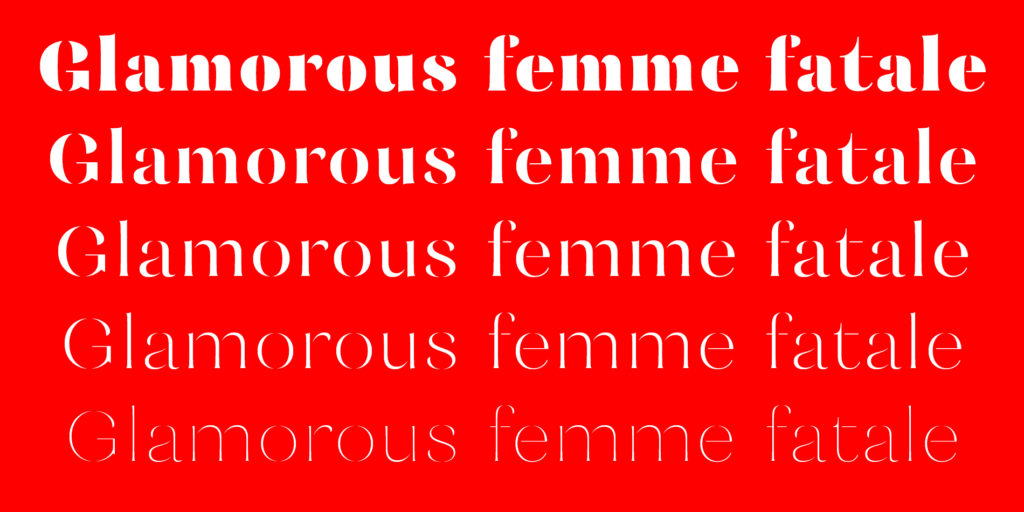
Mazette is a modern display face with a distinctive elegant look. The font is based on the refined shapes of Didot, a nineteenth century classic used for both display and text.
I didn’t start this project with any particular documented research on Didot. Instead, I tried to design a typeface from scratch while just keeping in mind Didot’s stability and majestic spirit, allowing myself a touch of freedom by breaking Mazette’s outlines in the way of a stencil typeface.
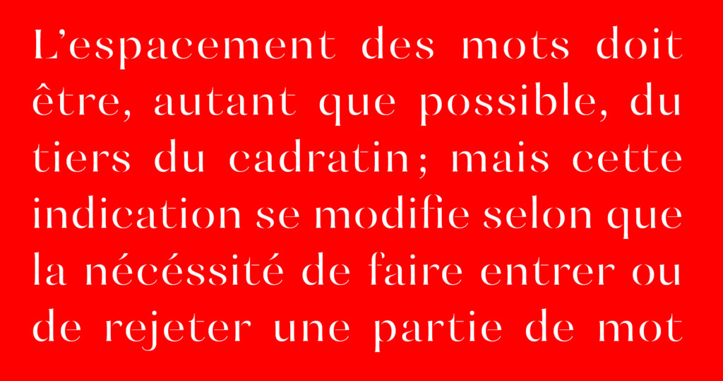
Mazette is made of separated parts combined together through blank spaces. These parts often end in an extremely sharp way that lends a piquant aspect to the typeface. There is a special rhythm created by the black strokes and the blank spaces that gives the page a sort of blinking effect.

Its structure as well as its legibility make it a perfect display typeface for publishing or branding. It will be very comfortable in the fields of fashion, luxury, cultural publishing, or any other universe that conveys a certain sense of elegance and uniqueness.