A typographic portrait of the brand’s founder, Joseph Krug.
The brand was looking for a typeface that evoked the presence of the soul of their founder, Joseph Krug, who founded the company in 1843. They asked for a typeface that would simulate his signature, so they could express the persistence of his vision within today’s company.
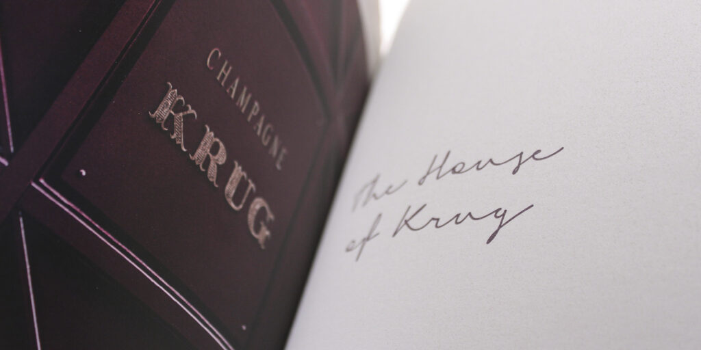
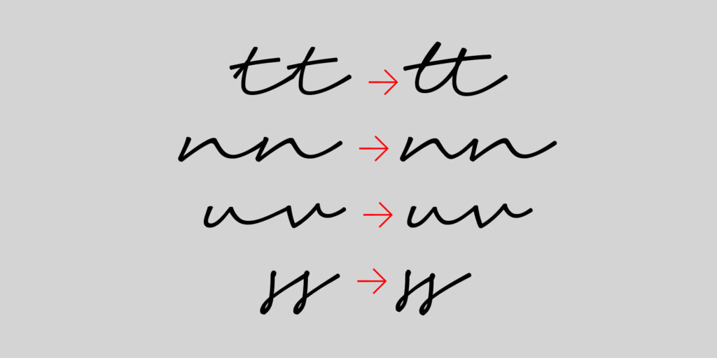
In collaboration with Servaire & Co agency, we started to develop a script typeface, thus offering the illusion of handwriting. We had found examples of the man’s actual handwriting, but it looked like an austere handwriting, typical of the 19th century. So we decided to turn away from it and start creating our own vision of a writing that would reveal his human qualities.
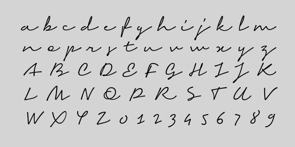
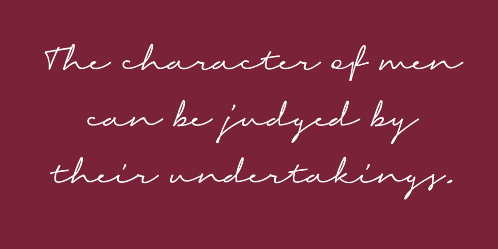
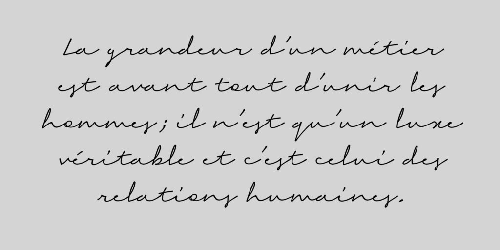
Thus, unlike the reproduction of an existing manual writing, Krug Hand was imagined starting from values: benevolence, humanity, natural authority. These qualities guided the creation of the forms, color and rhythm of this writing.
In short, to end up with a kind of typographic portrait of the founder of the brand.