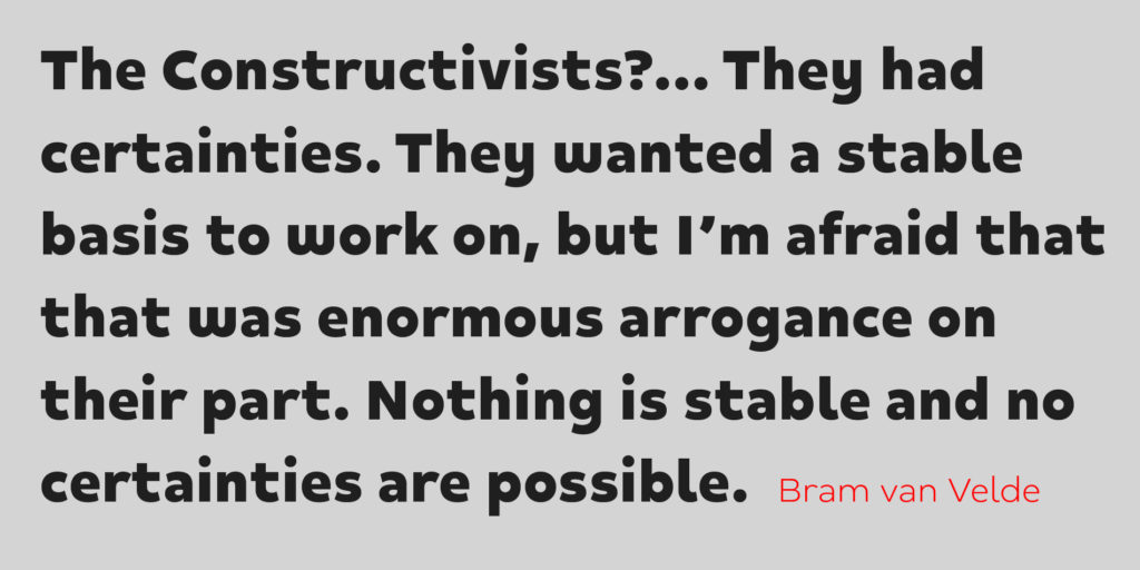
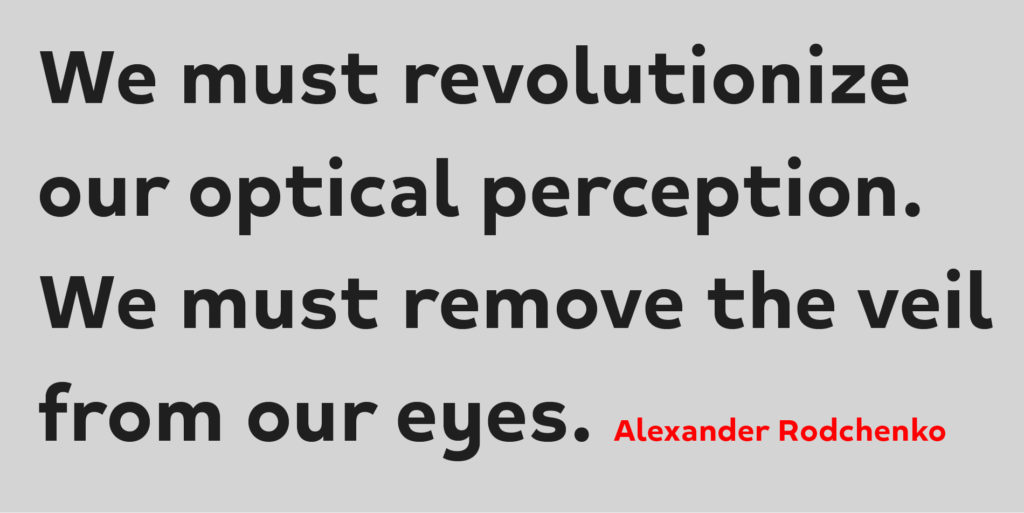
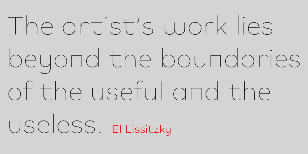
Mihaly is a geometric sans serif with a low contrast. It was designed with care to conserve a bit of geometric rigor feeling, referring to the constructivist ideal of the 20’s.
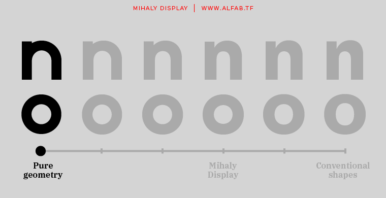
Mihaly’s very first version was designed in two hours with only circles, squares and diagonals. But beyond the joke of designing a font with pure geometric shapes, began an unexpected process: I started having fun testing the principles I had learned in school, “What if I don’t apply this or this optical correction… does it really not work ?”.
The game was to try to obtain a viable font, only allowing for as little distance as possible from geometry. The initial idea fizzled out, and by the end of the process, pure geometry had of course almost completely disappeared. But the overall design keeps a certain stiffness that gives Mihaly a distinctive personality.
Mihaly story
Mihaly was originally designed to be used for a photographic exhibition by Illés Sarkantyu, that took place in Budapest. The exhibition was about the photographer’s search for his father, Mihály Sarkantyu. And it was simply called: Mihály. Even long after the exhibition and after years of developing and refining the design, the project remains in my mind very much in relation to its original story. So much so that the font could not bear any other name.
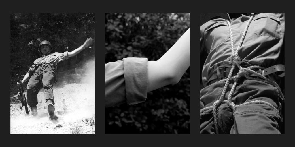
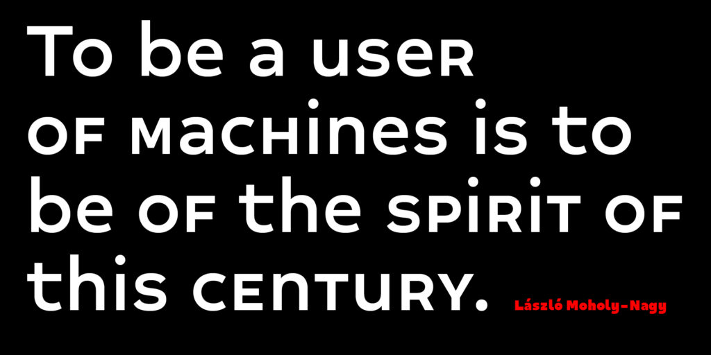
The piece of work dealt with black and white photographs from post-war era Hungary, which made me think of László Moholy-Nagy. Hence the move toward a geometric approach. But I had chosen to start my own experiment from scratch, without examining existing Bauhaus-related faces like Futura or the Bayer universal type.
A Din alternative
Indeed Mihaly is a very modern sans serif. The homogeneity of its proportions gives it a very modern neutrality, far from the constructivist flavor of a Futura, for example.
While designing the font I was able to test it in several graphic design projects, and tried to bring it to another territory I had in mind: the low-contrasted sans. I’ve always been fascinated by typefaces like Din or Interstate, whose flamboyant modernity comes principally I believe from the low contrast between thin and thick letter strokes. This makes them great fonts for display, but also reasonably usable in text.
In the end, I believe the most interesting qualities of Mihaly are the great regularity of its rhythm and its low contrast, which makes it a possible alternative to modern classics like Din or Interstate.