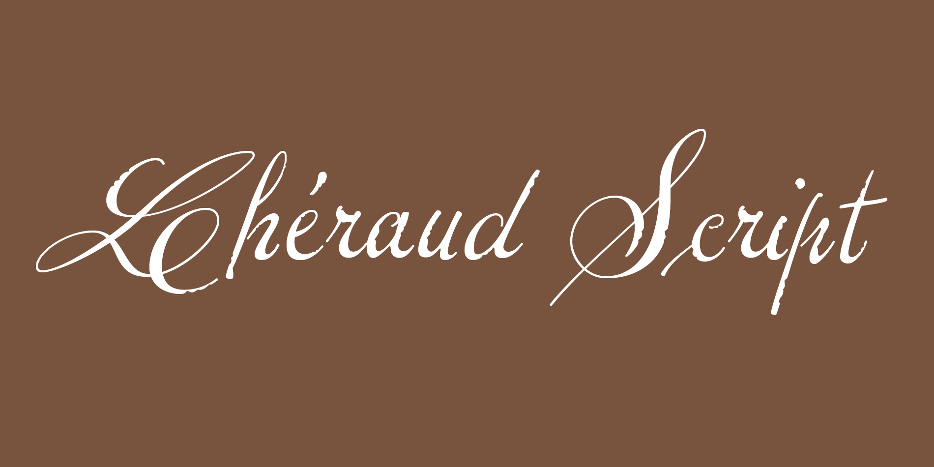
Lheraud Script
A typeface for the Lhéraud family’s Cognac brand, where all communication was used to be done by hand.
Continue reading

A typeface for the Lhéraud family’s Cognac brand, where all communication was used to be done by hand.
Continue reading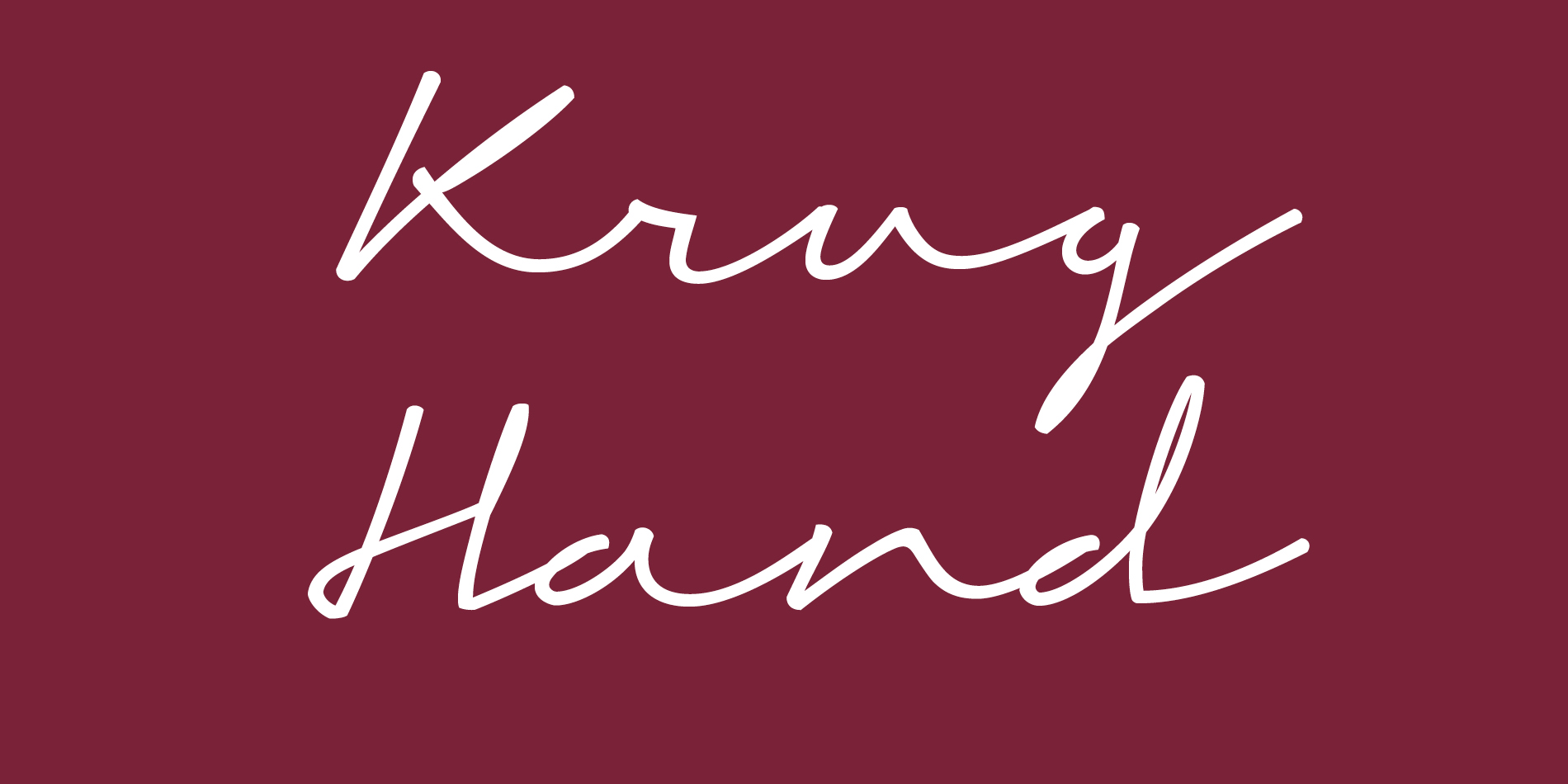
A typographic portrait of the brand’s founder, Joseph Krug.
Continue reading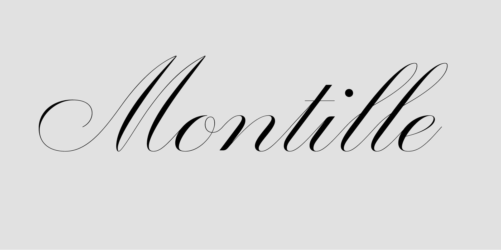
A typeface designed for the wine labels of Domaine de Montille, an independent and family house of high-end Burgundy wines.
Continue reading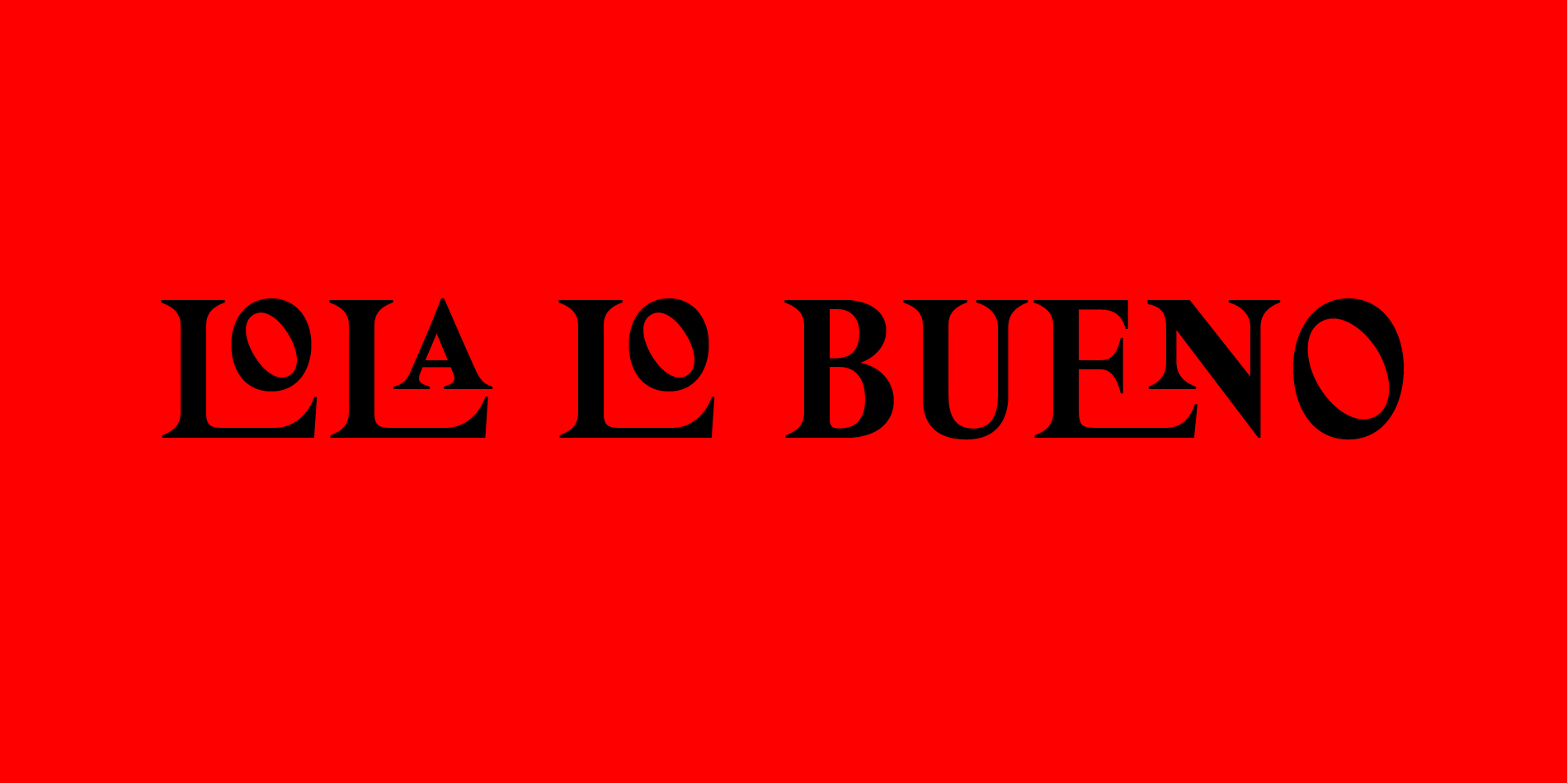
Custom typeface for Lola Lo Bueno, a new Spanish deli.
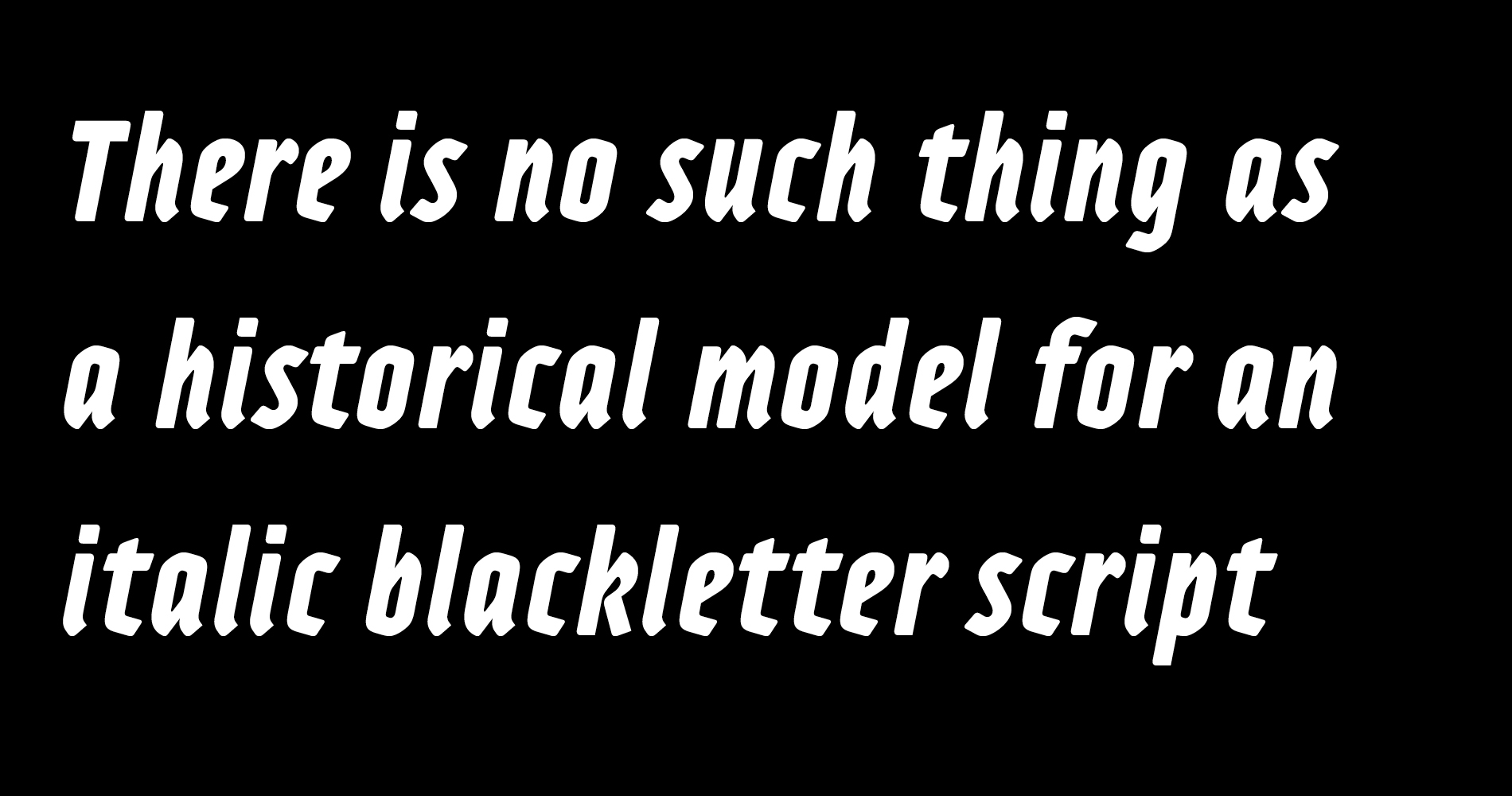
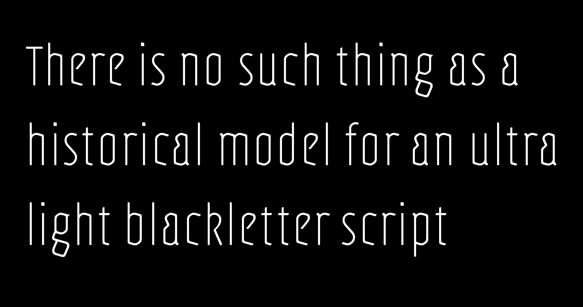
Adso is the result of a personal research on the possibility of re-acclimatizing gothic script into our contemporary world.
I’ve always loved blackletter scripts, as I’ve always loved medieval architecture and art in general. From my visiting of churches and castles and from my readings of manuscripts, I felt the desire to study blackletter historical context and to try to better understand their design.
But when I see blackletter used in today’s world, I don’t always feel comfortable with it.
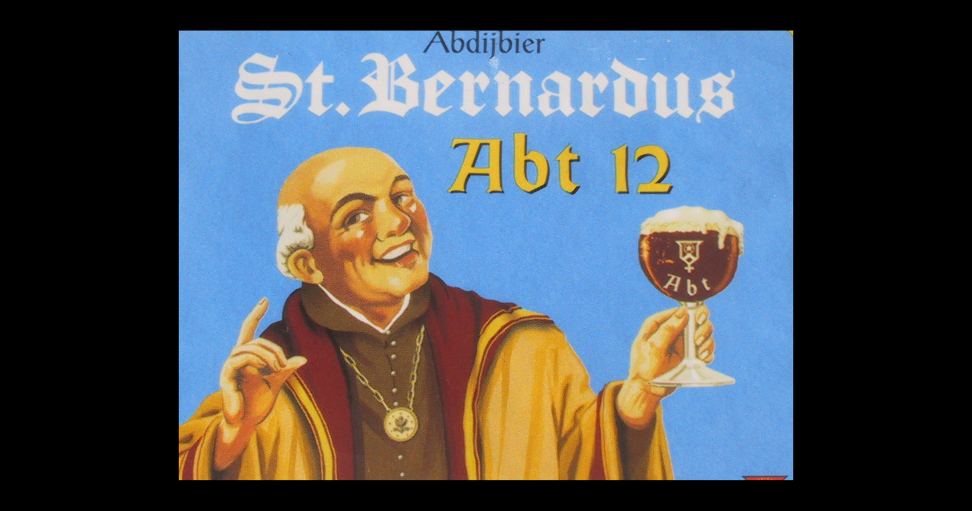
I like the modern use of blackletter when it is meant to suggest notions like tradition or authenticity, as in the antique dealers shop fronts or in some food shop fronts. This seems rightful to my eyes. But I hate to see blackletter typefaces overused in alternative counterculture imagery like in death metal or rap, conveying concepts like rebellion and aggressiveness. As if gothic art had been created to express these feelings. I find it almost an identity stealing.
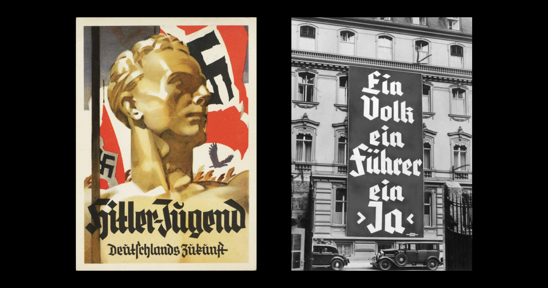
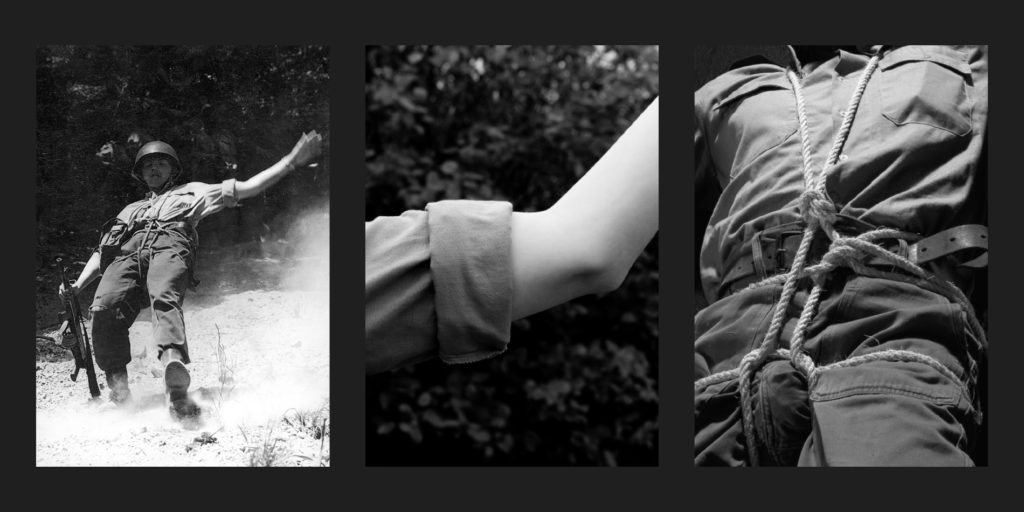
Blackletter is attributed with negative connotations such as violence, rebellion or marginality, since the Nazis made Fraktur faces a component of their discourse on the German racial identity throughout the thirties. Since then, all blackletter scripts have been stained with this infamous correlation.
But reducing blackletter to a German-only phenomenon is a countertruth. It is a European script, invented somewhere between France, Flanders and England, designed to write Latin language, and inspired by Christian and Greek philosophies. It was the script of the scholars in the nascent university. It was designed to be rational and universal. This is the way people saw it at the time.
In any case, blackletter is not a matter of marginality in itself, and I’d be very happy if in our times that fact could be demonstrated once and for all. Fortunately, some people have already dealt with the subject, and I modestly tried to contribute to it with this typeface.
I have had the opportunity to concentrate an entire year on this project, thanks to a scholarship from ANRT in Nancy, France.
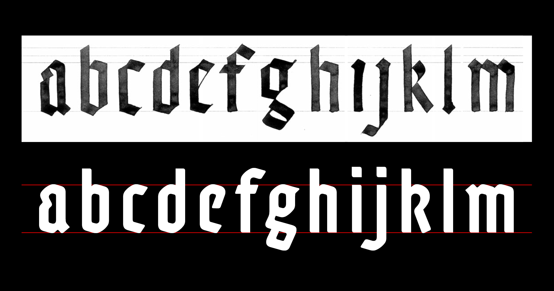
My approach was to amend the historical model of Textura. I started with calligraphy, for about two months. Adso was really born from a penholder. On one hand to take away from it the characteristics that can arouse bad reactions (illegibility, sharp angles). And on the other hand, to add to it some characteristics that suggest the rationality that was its origins. Even if those additions – round corners, diversity of the letter shapes, harmony between lower and upper case – come from humanist traditions.
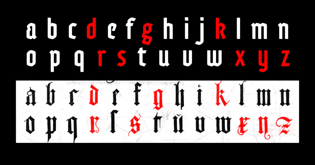
I even transplanted some purely humanist letter structures into my gothic system. In Adso’s characters set, d, g, k, r, s, x, y and z are more or less anachronistic, but they made the whole thing look more familiar, closer to us. Adso’s italic is in the same way a graft from humanist chancery calligraphy, done up to look gothic.
Then I got it through the computer and worked on redrawing the curves which really make the specificities of Adso. Especially the work on the thin letter strokes, which structurally cannot exist in Textura, and that had to be present in the light weights of the Adso family.
So from a certain perspective, one can say Adso is a hybrid typeface. But my intentions were in fact to manipulate heterogeneous elements in order to make perceive / help understand / render the original way people would perceive Textura in the XIIIth century. It’s a hybrid face that lay claim to a certain authenticity.
Finally, Adso remains a gothic script because it preserved the basic features of the gothic color: verticality, modular rhythm, darkness. It’s a gothic font for today: highly readable, and offering a wide range of uses.
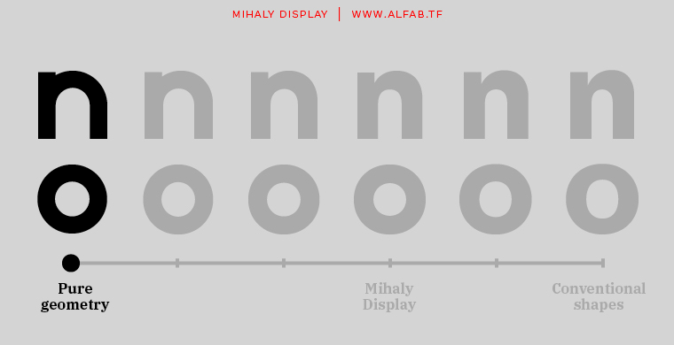
Mihaly is a geometric sans serif with a low contrast. It was designed with care to conserve a bit of geometric rigor feeling, referring to the constructivist ideal of the 20’s.
Mihaly’s very first version was designed in two hours with only circles, squares and diagonals. But beyond the joke of designing a font with pure geometric shapes, began an unexpected process: I started having fun testing the principles I had learned in school, “What if I don’t apply this or this optical correction… does it really not work ?”.
The game was to try to obtain a viable font, only allowing for as little distance as possible from geometry. The initial idea fizzled out, and by the end of the process, pure geometry had of course almost completely disappeared. But the overall design keeps a certain stiffness that gives Mihaly a distinctive personality.
Mihaly was originally designed to be used for a photographic exhibition by Illés Sarkantyu, that took place in Budapest. The exhibition was about the photographer’s search for his father, Mihály Sarkantyu. And it was simply called: Mihály. Even long after the exhibition and after years of developing and refining the design, the project remains in my mind very much in relation to its original story. So much so that the font could not bear any other name.
The piece of work dealt with black and white photographs from post-war era Hungary, which made me think of László Moholy-Nagy. Hence the move toward a geometric approach. But I had chosen to start my own experiment from scratch, without examining existing Bauhaus-related faces like Futura or the Bayer universal type.
Indeed Mihaly is a very modern sans serif. The homogeneity of its proportions gives it a very modern neutrality, far from the constructivist flavor of a Futura, for example.
While designing the font I was able to test it in several graphic design projects, and tried to bring it to another territory I had in mind: the low-contrasted sans. I’ve always been fascinated by typefaces like Din or Interstate, whose flamboyant modernity comes principally I believe from the low contrast between thin and thick letter strokes. This makes them great fonts for display, but also reasonably usable in text.
In the end, I believe the most interesting qualities of Mihaly are the great regularity of its rhythm and its low contrast, which makes it a possible alternative to modern classics like Din or Interstate.
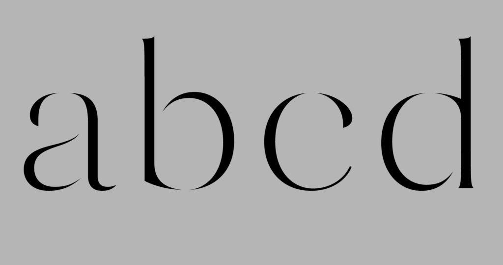
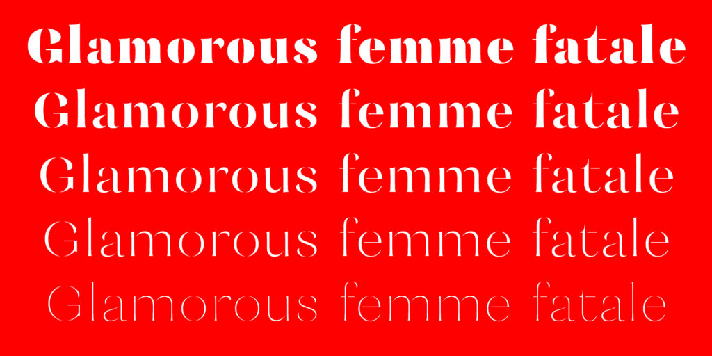
Mazette is a modern display face with a distinctive elegant look. The font is based on the refined shapes of Didot, a nineteenth century classic used for both display and text.
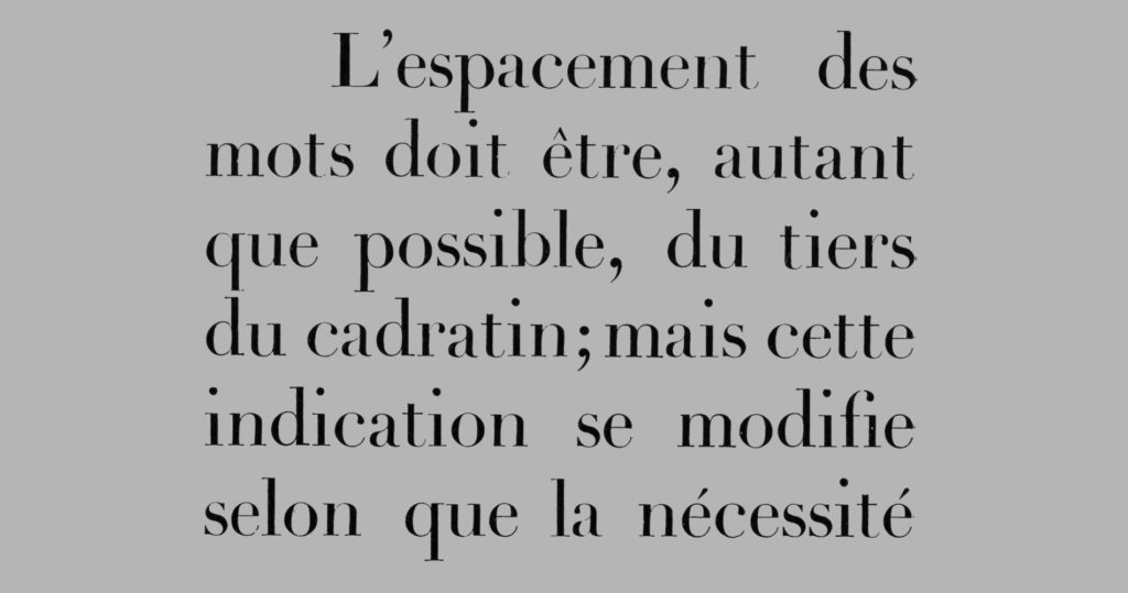
I didn’t start this project with any particular documented research on Didot. Instead, I tried to design a typeface from scratch while just keeping in mind Didot’s stability and majestic spirit, allowing myself a touch of freedom by breaking Mazette’s outlines in the way of a stencil typeface.
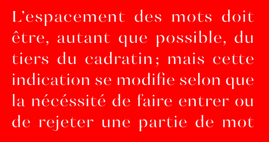
Mazette is made of separated parts combined together through blank spaces. These parts often end in an extremely sharp way that lends a piquant aspect to the typeface. There is a special rhythm created by the black strokes and the blank spaces that gives the page a sort of blinking effect.
Its structure as well as its legibility make it a perfect display typeface for publishing or branding. It will be very comfortable in the fields of fashion, luxury, cultural publishing, or any other universe that conveys a certain sense of elegance and uniqueness.
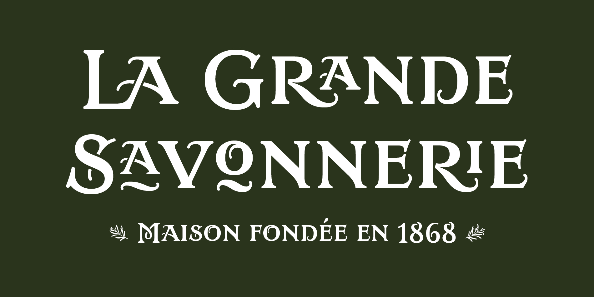
A corporate typeface design for the visual identity of La Grande savonnerie, a traditional soap factory in Marseille.
Continue reading